One of the first six maps for Team Fortress 2, Dustbowl remains favourite for many, I’ve seen it criticized as under detailed and bland but I feel that it’s right at the pinnacle of TF2. One of my favourites for both gameplay and aesthetic value, definitely.
Let’s pick it apart and see what we can learn!
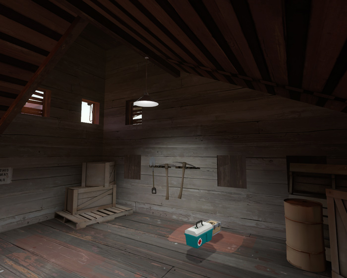
Windows, Valve uses them a lot. They’re a very easy way to add detail to a building, inside and out. Boarded up windows are good at adding detail without changing any gameplay value, The only window that isn’t boarded up here is virtually useless, you could lob a nade through there, but the chances of being able to do so without being shot from the other side are slim.
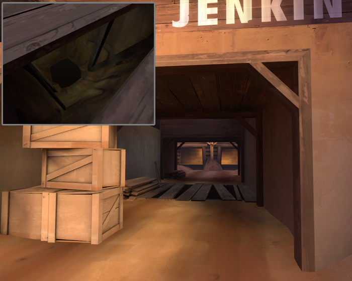
This corridor is quite an enclosed space, especially as there are wood piles down it’s length and crates at the end. The boarded up pit under it and open roof help make it feel less claustrophobic. If you look above the pit there is actually a mine head directly above it, some good continuity, rather than just a random pit. As I said in the others in this series, you can make an area feel larger by adding visible but inaccessible sections at the limits of the area, in order to be able to act this way, the pit would need to be lighter so you can actually see it. It’s already in shadow and boarded up, it would be almost pitch black if there wasn’t a fake light in there, half way down is a single, dim, light entity giving enough ambient for you to see into the pit from above.
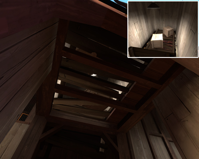
Another inaccessible area, this one doesn’t add much to make the area feel larger though. It’s main purpose is to provide light to the area below. Often light props hang down too far from a low ceiling to effectively light the room. If the area above the room isn’t being used you could raise the ceiling, or do something like this. This solution requires a brighter light as a lot of it is blocked by the props, you can see how bright the light is in the inset.
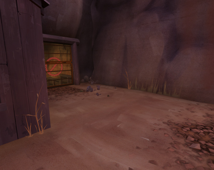
These grass props have a very low polycount and go great against building and cliff bases, the grass overlay also is a good way to add a little bit of blending into the bottom of a cliff. That same overlay is also used at the top of some of Dustbowl’s cliffs, adding a little overhanging grass looks great. Both prop and overlay can have reasonably short fade distances if they’re in an intensive area.
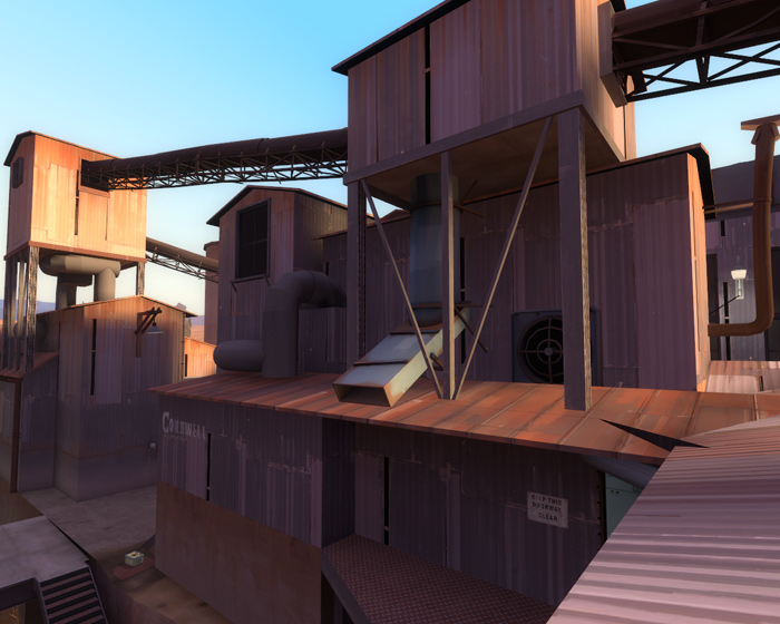
Too many custom maps have very bland and flat rooftops, there isn’t much to say about this one except look how much stuff there is on these roofs. Vents, pipes, chutes, chimneys, little raised bits, conveyors. Obviously the amount of this you should employ depends on how industrial your environment is, also don’t forget that there are a lot of bland flat rooftops in real industrial environments, but they’re less interesting.
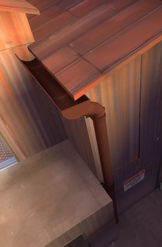
Again not a lot to say for this, just that a lot of custom maps neglect drain pipes and gutters when almost every building has them in reality. The gutter props have two skins, this rusty red and a grey version, good for red and blu themed gutters.
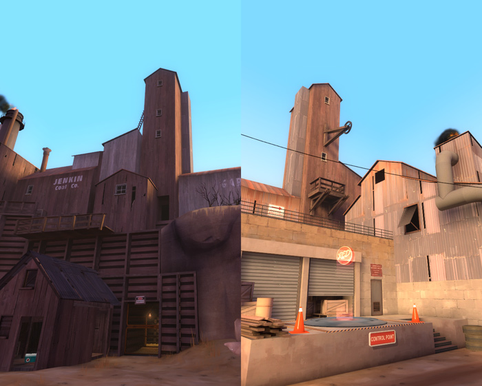
Tall buildings like this are awesome, they look cool, provide continuity since you can see them from multiple areas in the map and they cut down the amount of stuff you have to make. As long as the whole thing is a func_detail it will be entirely visible from both sides of the skybox brush that is cutting it in two. If you still want it to block vis as well as being visible on both sides, make a copy of it the same size and shape and leave that as nodraw (world brushes) and that will cut vis without shadowing the func_detail. (This method is used for Badwater’s tower).
Just 2Fort left to rewrite from TF2maps.net, then I’ll do one more based on popular opinion, leave a comment.
Tags: detailing, Dustbowl, func_detail, Lights, overlays, Team Fortress 2, tf2
You know, I never really notice that giant building at the end but have always known of its existence.
I always try to put things like that in my map, but it always seems impossible to do.
Good part 3, looking forwards to 4 🙂
So you’ll write up a new one after 2Fort? My suggestions would be Granary, Lumberyard, or Yukon.
This has been a really great series and it’s probably something that any mapper doing a detail pass on his map ought to at least skim through just to keep all the possibilities in mind. The point regarding light from an inaccessible area was one I found particularly interesting simply because it’s something I hadn’t even really considered; though it’s important to keep in mind that players, like moths, are often drawn to light sources and we don’t want players paying too much attention to non-gameplay areas.
Suggestions for the popular opinion map:
Viaduct – Has some really interesting stuff outside the play area and the detailing inside some of the buildings is really incredible.
Coldfront – Not sure if you’re sticking to “made by Valve” maps; if not, Coldfront is pretty friggin’ awesome in the detail department.
> It’s main purpose is to provide light to the area below
> wood piles down it’s length and crates
Its, not it’s.
Cant believe I found an interesting article about the windows in Team Fortress 2! This should be boring but for some reason it aint haha